WEBSITE DESIGN REVIEW
Chess Openings Mastery Website Review: From Browsing to Practice
A learning website has to do more than collect information: it needs to help visitors take a useful next step. We review how Chess Openings Mastery connects its opening guides with practical training.
A review of the learning website’s layout, navigation and practice journey.
A clear purpose, with practical routes into training
The reviewed pages connect an opening catalogue with an activity visitors can try. The most useful design choices are a visible board, a suggested starting route and direct links from explanations to practice.
A focused purpose for a recognisable audience
Chess Openings Mastery is aimed at people who want to practise the early moves of a chess game. Its chess opening trainer gives the website a specific purpose: visitors can move from reading about an opening to recalling a line on a board.
That focus is useful from a design perspective. Rather than asking the homepage to serve every possible chess interest, the site centres one task. The promise is easy to grasp, and visitors can decide whether it matches the part of their game they want to work on.
The opening screen makes the activity visible
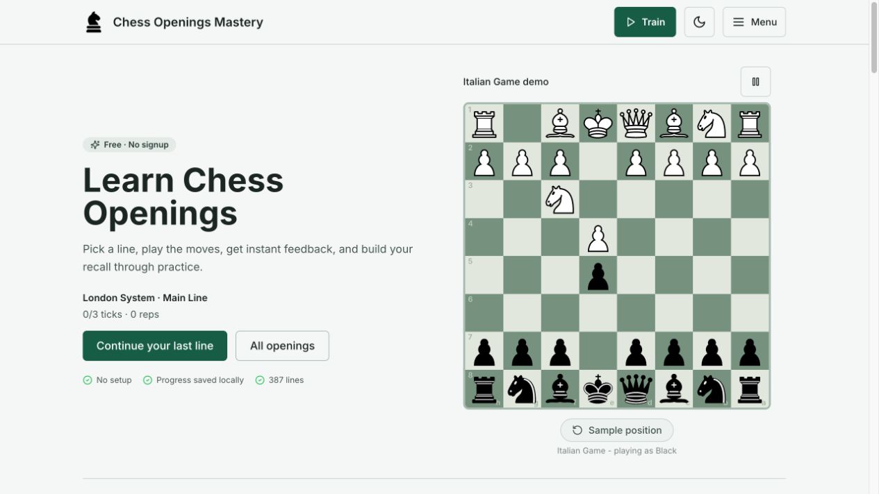
The desktop homepage places the main explanation beside a chessboard demonstration. Muted green squares, a pale background and dark text give the interface a coherent visual identity. The board also shows the kind of activity the visitor can expect before they commit to a training session.
In the browser used for this review, the homepage offered a return to the last London System line alongside a route to all openings. That is a sensible distinction between continuing a task and exploring a new one. It also makes the opening screen useful on a return visit, rather than treating every visit as a first introduction.
The London System page turns a choice into a next step
The London System page identifies the playing side, opening moves and intended experience level, then offers a direct practice link. This answers several immediate questions before presenting the full collection of variations.
Further down, the training links are grouped into common replies, sharper options and advanced hybrids. Those headings suggest a sequence rather than presenting every variation as equally urgent. A newcomer can start with the main line; a returning player can find a particular response.
Explanatory sections cover plans, pawn structures and strengths and weaknesses. Their expandable presentation keeps the page manageable, although a reader has to open them to see the detail. The arrangement offers a useful bridge between choosing a drill and understanding why the opening is played.
Set clear expectations about progress and external links
The London System page says progress is saved in the browser and explains its clean-completion milestones. These details matter because a visible progress indicator invites people to invest effort. Readers should understand where that record lives and what it measures; completing a drill is different from demonstrating playing strength in a full game.
The same page separates its practice links from a Chess.com membership link marked as an affiliate link. Clear labelling helps visitors distinguish training on the current website from an offer on another service. Our review covers the public presentation, rather than the terms or performance of that external service.
Where the journey could become clearer still
The strongest opportunity is to make the first recommended action consistently prominent wherever a beginner enters. Someone arriving directly on a detailed opening page should be able to identify one sensible first line as quickly as someone arriving on the homepage.
A second useful refinement would be a short, persistent explanation near progress controls of what is stored locally and what happens when browser data is cleared or another device is used. The existing browser-storage wording is helpful; repeating that context at the point of use could prevent misplaced expectations.
Finally, the relationship between reading, practising and playing a real game deserves continued emphasis. A visitor should leave a drill knowing both how to repeat it and where to find the ideas behind the moves. These are editorial suggestions, not evidence of measured usability problems or changes made to the reviewed site.
Our verdict: a learning tool with a clear direction
Chess Openings Mastery makes a specific learning activity the centre of its design. The board demonstration, practical routes into openings and structured London System page provide a coherent journey from curiosity to a practice choice.
For anyone designing an educational website, the useful lesson is to connect information with an action the visitor understands. Explain the subject, offer a manageable starting point and make the next step easy to find. This site provides a concrete example of that approach, while leaving room to make progress expectations even clearer.
Sources and review scope
Reviewed 27 October 2026 by Admin. Sources: the Chess Openings Mastery homepage and its London System page.
This editorial review covers public-page content, desktop layout, navigation and visible link destinations. It is not a full accessibility audit or a measurement of learning outcomes. No forms were submitted, no purchases were made and the reviewed website was not modified. Screenshot: Chess Openings Mastery homepage, captured 27 October 2026 and reproduced for editorial review; the return-to-training state reflects the browser used.