WEBSITE DESIGN REVIEW
Memorial Jewellery UK Website Review: Clear Design and Thoughtful CTAs
A positive review of a personal keepsake website that makes its maker, services and next steps easy to find. We look at the design choices that work and three practical ways to strengthen the enquiry journey.
Editorial website-design review by the publisher. This is not a customer testimonial or an assessment of the maker's workmanship.
What the website does well
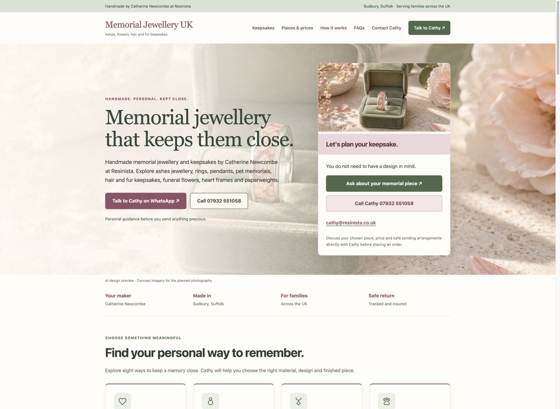
The site brings a named maker, a clear range, visible contact routes and practical prices and process information together. Our three suggestions are real commission photography, a simpler opening CTA hierarchy and a compact pre-order checklist.
A clear purpose, with a recognisable person behind it
MemorialJewellery.uk makes its purpose easy to understand: personal memorial jewellery and keepsakes, with Catherine Newcombe at Resinista identified as the maker. The homepage states the Sudbury, Suffolk base and UK-wide audience, rather than leaving visitors to work out who they would be contacting.
That is a useful design choice. A personal commission involves questions that a product photograph cannot answer. Showing the maker's name and contact routes gives the next step a human context, while the service descriptions explain the range without requiring visitors to know specialist terminology.
Our positive assessment concerns the website's communication. We have not commissioned a piece, verified customer outcomes or independently assessed workmanship. The useful lesson for another small business is simple: make the offer, the real business identity and the contact destination easy to find.
The visual identity suits the subject
The dusty pink and sage colour scheme gives the site a gentle, cohesive identity. Decorative headings bring character, while the service labels, prices and contact details use more straightforward text. The combination feels appropriate for a considered personal purchase rather than an aggressive retail promotion.
On the homepage, sections separate the range, prices, process and common questions. That creates a useful sequence: understand the choices, compare the practical details, then start a conversation. The imagery sets the intended mood, and the site explicitly labels its current AI concept pictures rather than presenting them as completed work.
This is an editorial design judgement, not a finding from a user study. The point worth borrowing is the relationship between presentation and purpose: the styling supports the subject while the headings still help a visitor navigate the page.
The calls to action invite a conversation
The site offers direct WhatsApp and phone routes, alongside email and a dedicated contact form. Prompts to ask about a piece make sense for a service where the design, materials and price are agreed with the maker. The destination matches that promise: begin an enquiry rather than complete an instant purchase.
The surrounding copy also explains that visitors do not need a finished design before contacting Cathy. This addresses a plausible hesitation without inventing urgency or claiming that a customer must make a decision immediately. The contact section reinforces that visitors can take their time.
For Rippleclick, this is the strongest transferable CTA lesson. Match the invitation to the actual next step and answer the question that might stop someone taking it. GOV.UK's button guidance similarly recommends wording that describes the action. We did not send an enquiry or measure responses during this review.
Specific service pages help people find their own route
The homepage links to separate pages for ashes jewellery, rings, pendants, pet memorials, hair and fur keepsakes, flowers and other remembrance pieces. This is more useful than forcing every question into a single short product description. Visitors can move from a broad idea to information about the particular inclusion or piece they have in mind.
Someone exploring memorial jewellery with hair, for example, can use the hair and fur keepsakes page. It discusses wearable jewellery and keepsakes, design choices, combinations and the questions to ask before sending material. The page provides a relevant route for that interest without assuming ashes are required.
Descriptive service names and links help the browsing journey. They also give each page a defined subject; that is sensible content organisation, not a guarantee of search rankings. A page earns its place when it answers a distinct visitor need rather than repeating the homepage with a different phrase.
Prices and process provide practical reassurance
The homepage shows starting prices and explains that the final specification and delivery arrangements are agreed directly. Product cards distinguish materials and options, rather than presenting one price as though it applies to every commission. This gives visitors a starting point for a budget conversation without pretending to be a final quote.
The process section explains that the design and practical arrangements come before sending precious materials. FAQs answer common introductory questions, while contact details remain available for anything specific. Together, these elements make the site more useful than a gallery with an unexplained contact button.
The lesson is to place decision-supporting information near the action. It is possible to have a strong enquiry focus while still answering costs, scope and next-step questions. None of this proves how the business performs operationally, but it is a positive feature of the published customer journey.
Improvement 1: replace concept imagery with real commissions
The most valuable next step would be a consistent gallery of actual finished work, photographed with permission. The current concept-image labels are clear and should remain wherever those images are still used. They establish the proposed visual direction, but they cannot demonstrate the finish of a real commission.
A future gallery could show an overall piece, a close-up and an indication of scale, with the material and design identified. For hair or fur pieces, photographs could demonstrate discreet and visible inclusion options only where real examples exist and permission allows them to be shown.
This would add concrete evidence while preserving the visual style. It should not be rushed by inventing examples, customer stories or testimonials. This is a recommendation for the next content pass, not a claim that photographs have already been commissioned or that they will produce a particular uplift.
Improvement 2: simplify the opening action hierarchy
The opening view contains several contact opportunities across the navigation, hero and adjacent panel. They are useful routes, but the hierarchy could be quieter: one clearly preferred conversation action, a secondary phone option and a compact alternative for email or the form.
A small refinement would reduce repeated invitations in the first view while retaining contact options later in the page and on relevant service cards. The primary wording should remain consistent with the destination, and people who do not use WhatsApp should still have an obvious alternative.
Test that change before assuming it is better. Observe whether visitors can identify the next step and complete their chosen route. Repeated CTAs can be helpful on a long page; the recommendation is about emphasis in the opening view, not removing all repetition or restricting contact choice.
Improvement 3: add a concise pre-order checklist
The site already distributes useful guidance across its process, product pages and FAQs. A short checklist close to the enquiry action could bring the key decisions together: chosen piece and inclusion, full quote, sizing or chain options, sending instructions, current making estimate, return arrangements and care guidance.
Link each point to the relevant existing detail instead of adding another long introduction. If cancellation or change-of-design terms apply, make their current explanation easy to find before payment. Ask Cathy for any business detail that is missing rather than filling the gap with a standard promise.
For the contact form, preserve the focus on information needed to begin a conversation and explain what happens after sending it. W3C's form guidance supports clear labels, necessary fields and useful feedback. No fixed response time or order terms should be added unless the business confirms them.
Our verdict: a strong foundation for a thoughtful enquiry journey
MemorialJewellery.uk does several important things well: it identifies the maker, explains the range, offers direct contact and provides price and process information. The design gives the subject room to breathe while keeping the next step visible. That is a positive foundation for a personal, conversation-led service.
The three proposed improvements build on that foundation: replace concepts with real product evidence, simplify the first-view CTA emphasis and gather essential pre-order details into a short checklist. They do not require turning the site into a pushy checkout or promising results that have not been measured.
For anyone planning a similar website, the useful takeaway is to connect identity, relevant content and an honest next step. A page about a sensitive purchase should help someone decide what to ask, at their own pace. MemorialJewellery.uk provides a good example of that direction.
Sources and editorial notes
Reviewed 8 October 2026 from the published homepage, service and contact content. Positive judgements concern website presentation, not a purchased product or customer experience. No conversion analytics, response-time test or independent workmanship assessment was used. The three improvements are proposals; MemorialJewellery.uk was not changed.
View dated sources and image rights
- MemorialJewellery.uk: homepage reviewed · researched 2026-10-08
- MemorialJewellery.uk: hair and fur keepsakes page reviewed · researched 2026-10-08
- MemorialJewellery.uk: contact page reviewed · researched 2026-10-08
- GOV.UK Design System: button wording and hierarchy · researched 2026-10-08
- W3C: accessible forms · researched 2026-10-08
Image: MemorialJewellery.uk website screenshot, captured 8 October 2026. Original and rights information. Reproduced with the site owner's permission. Optimised for web display; the layout may crop its visible area.