WEBSITE DESIGN REVIEW
Trade Register Website Review: Helping Local Customers Find Trades
A practical design review of a UK trades directory with two audiences: people looking for local services and businesses wanting to be found. We explore its purpose, clear browsing routes and opportunities to make the journey even better.
Editorial website-design review by the publisher. No businesses were contacted and no listing, payment or customer outcome was tested.
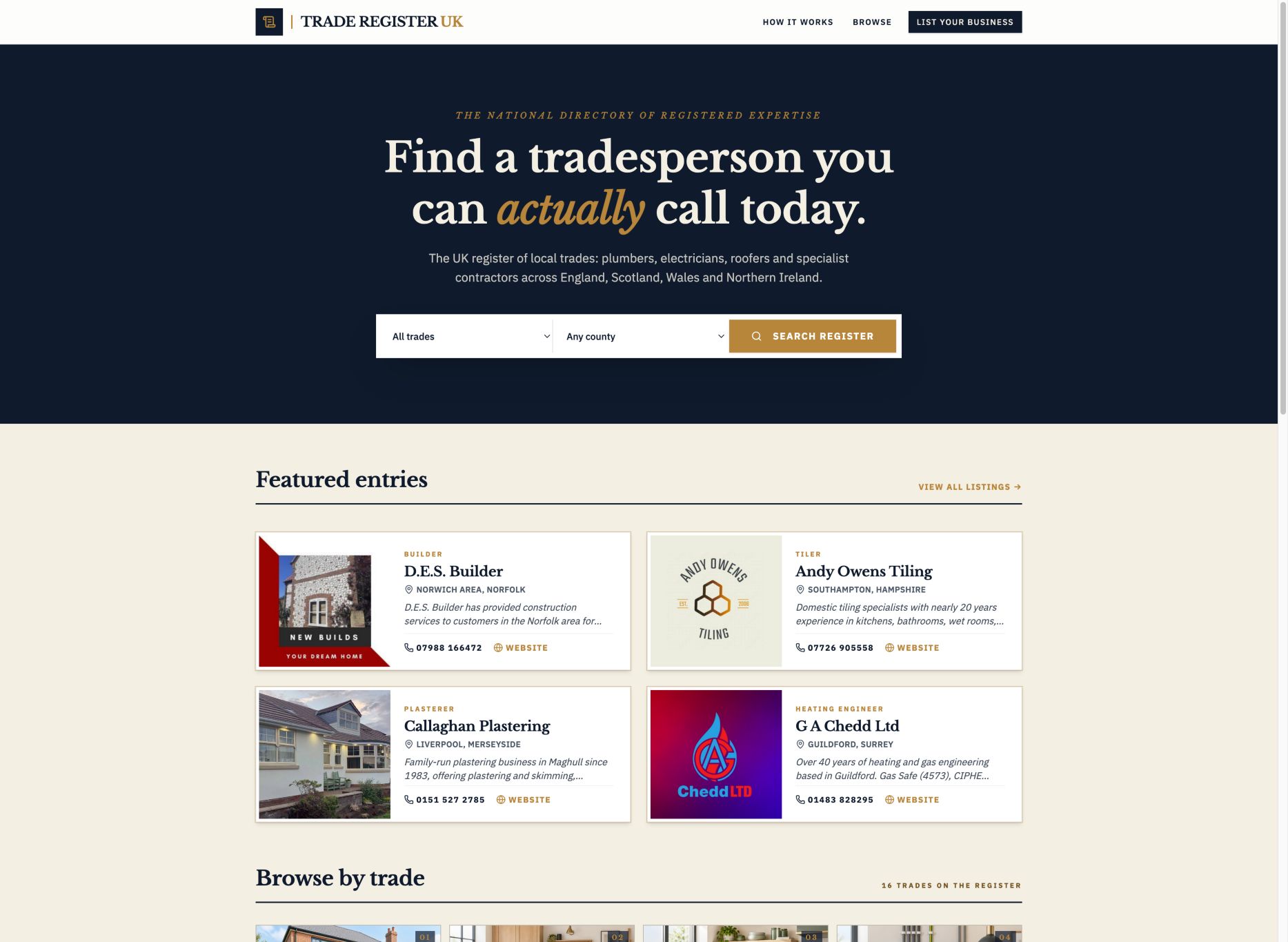
A directory with a clear next step
Trade Register organises home-service businesses by trade and location, with direct contact information. The design supports both finding a tradesperson and listing a business. Its role is discovery, not accreditation or guaranteed work.
What Trade Register is for, who it could help and why
Trade Register is a UK home-services directory designed to connect people looking for local work with businesses offering it. It could help a homeowner searching for a plumber, a landlord comparing maintenance contacts or someone planning a renovation find relevant business details in one place. It could also help a small trade business present its services and contact routes to people browsing by trade and location. The value is practical discovery: organise the information, show where a business works and make the next conversation easier. A listing does not guarantee availability, workmanship, enquiries or search rankings.
The site therefore serves two audiences with different tasks. Customers want to find and assess possible providers; businesses want to explain their offer and be discoverable. The homepage makes both routes visible, rather than asking everyone to follow the same generic contact journey.
The opening design puts the task before the introduction
The homepage places trade and county selectors alongside a search action. That is a positive design choice for a directory: visitors can begin with the service and area they need instead of reading a long description of the platform.
The navy, gold and light-background presentation creates a recognisable identity. Large headings establish the purpose, while the search controls and listing invitation have different roles. Browse-by-trade and location links offer another route for people who prefer exploring to entering a search.
From Rippleclick's perspective, the useful principle is to make the main task visible early. The review is an editorial observation of the published interface, not a claim that this styling produces more clicks or that every accessibility requirement has been audited.
Browsing gives customers a route from trade to contact
During our review, the Plumber category opened a trade-specific results page with search, trade and location filters. The town selector asks visitors to choose a county first. Listing cards showed business names, locations, short descriptions and direct contact or website options where provided.
This sequence gives the browsing journey a sensible structure. A visitor can move from a broad need to a relevant area, then inspect a business rather than having to interpret an undifferentiated wall of names. Descriptive headings and service categories help explain what the current page is showing.
Customers should still check the business's actual coverage, suitability and availability before arranging work. The directory presents information; it does not replace checking relevant credentials, discussing the job or agreeing a quote. We did not contact any listed business or test whether its information was current.
The business-listing journey explains the commitment
The listing form asks for core business and location information, contact details and a description. A photo or logo is optional, and the page explains that it can be added later. It also separates whether an email address should be publicly displayed from the address used by the directory team.
These explanations are useful because they reduce uncertainty before submission. A business can understand the required information without assuming it must create an account, produce photography or publish every contact detail immediately. The how-it-works page describes suitability review, listing maintenance and direct customer contact.
Trade Register says standard listings are free and customers contact businesses directly, without job commission taken by the directory. Optional paid visibility is a separate choice. Businesses should check current review timings and paid terms rather than assuming a submission goes live instantly. We inspected the public form but did not submit a listing or buy an upgrade.
Improvement 1: explain the review limits near the first search
The how-it-works page makes clear that directory review is for suitability and is not endorsement or accreditation. Bringing a short version of that explanation closer to the initial search and listing results would help visitors interpret the register language correctly.
A compact note could explain that customers should confirm relevant qualifications, service coverage and the details of the job directly. Link to the fuller explanation rather than filling the homepage with warnings. The aim is to support informed decisions while keeping the discovery task simple.
This is a constructive clarity recommendation, not an allegation that listed businesses are unsuitable. A directory can be useful without presenting itself as a certification scheme, and the interface should make that distinction easy to understand.
Improvement 2: offer a quicker route to a town or postcode
The existing trade and county search is a useful starting point. For visitors with a precise location, an optional town or postcode route nearer the homepage search could reduce the steps needed to reach local choices. It should complement browsing rather than replace the existing filters.
Explain whether results represent a business's base or the area it serves. Those are different things, especially for contractors who travel. If distance or proximity is shown, define the calculation and avoid implying that the nearest business is necessarily available or best suited to the task.
Before adding a feature, observe how people use the current journey. Test labels, mobile input and what happens when an area has few results. A quicker form is useful only if it leads to understandable results, not simply a larger list.
Improvement 3: make freshness and featured placement more explicit
A visible date for when a business last confirmed its details would help customers judge how recent a profile is. It should reflect a real confirmation event, not merely when a page was generated. Explain how customers can report incorrect details and how businesses can update them.
The site already labels featured entries. A concise explanation of what featured placement means would make the distinction between paid prominence and suitability review easier to understand. It should not suggest that paying for visibility makes a business more qualified.
These are improvements to interpretation rather than promises of better results. Clear labels, useful supporting instructions and necessary form fields are consistent with the user-centred approach described in W3C's forms guidance. Keep additional explanation brief and available where the decision happens.
Our verdict: a useful example of designing for two audiences
Trade Register has a clear practical purpose and gives both audiences an identifiable next step. Customers can browse services and locations; businesses can understand the listing process and begin a submission. The interface connects categories, locations and contact information instead of relying on a decorative homepage alone.
The strongest design lesson is task separation. Searching for a contractor and promoting a business are related, but they are not the same action. Different labels and routes help people choose the journey that fits them.
Our suggested refinements are clearer review-limit messaging, a more immediate precise-location option and visible information about profile freshness and featured placement. The underlying direction is positive: make useful information easy to find and the next action understandable. This is a website-design review, not a customer testimonial, accreditation assessment or forecast of leads.
Sources and editorial notes
Reviewed 8 October 2026 from the live homepage, Plumber browsing results and public listing guidance. Design judgements are editorial observations, not measured conversion findings. No enquiry, listing submission, purchase or provider verification was performed. Proposed improvements were not applied to Trade Register.
View dated sources and image rights
- Trade Register: homepage reviewed · researched 2026-10-08
- Trade Register: directory browsing reviewed · researched 2026-10-08
- Trade Register: listing process and limits · researched 2026-10-08
- Trade Register: submission form inspected · researched 2026-10-08
- W3C: accessible forms · researched 2026-10-08
Image: Trade Register website screenshot, captured 8 October 2026. Original and rights information. Website screenshot reproduced for editorial review. Optimised for web display; the layout may crop its visible area.